Branding/Packaging
The Brief:
Create a logo that captures the playful charm of a vintage soda shop while also incorporating a heartfelt tribute to the owner's beloved puppy, "Bub." The design should visually connect with the sister company, One Earth, located next door, to ensure a cohesive brand identity between the two establishments. The goal is to craft a logo that not only becomes a customer favorite but also inspires them to purchase branded merchandise like t-shirts and hats.
My Approach:
I designed a logo using playful fonts and a popsicle icon in a vibrant orange hue that perfectly complements the orange tones of the One Earth logo. To honor the memory of Bub (affectionately known as Trudeau), I subtly integrated a paw print motif. I extended this branding strategy throughout the store, applying it consistently to both interior and exterior signage to create a unified and memorable visual experience.


BRANDING GUIDELINES

The Brief:
Revise the logo and furnish a comprehensive branding style guide for both external and internal partners. Additionally, create a tailored social media campaign specifically designed for LinkedIn.
My Approach:
While a logo had been previously established in CMYK format, I refined it by selecting a Pantone color palette and further developed guidelines for logo usage, typography, and the brand's tone of voice.
PACKAGING
The Brief:
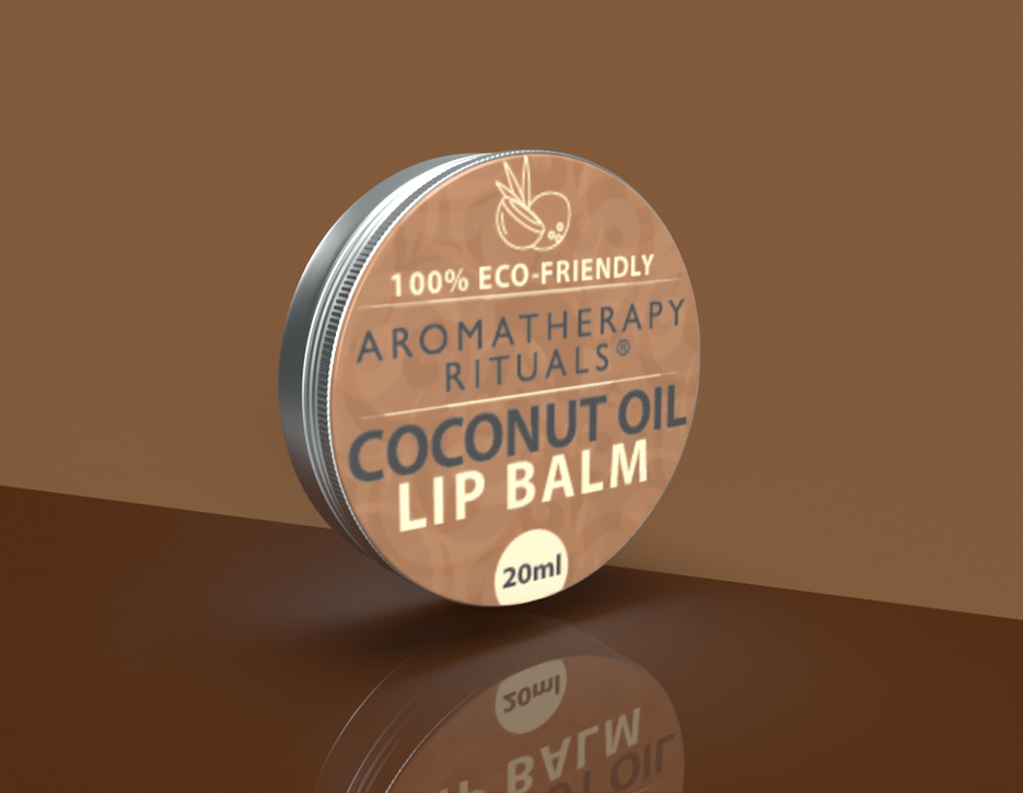
Develop a line of lip balms for Old Navy stores across the US and Canada, overseeing the entire process from product design to branding development.
My Approach:
I began with a thorough competitive analysis, researching emerging colors, patterns, and fashion trends to inform the design direction. Based on these insights, I created a diverse range of nine concepts, covering a spectrum from fast fashion to more conservative designs. Despite a tight deadline of seven days, I successfully completed the project in just five days, demonstrating efficiency and creativity under pressure.

SIGNAGE


The Brief:
Redesign and mock up all internal wayfinding and design signage for Woodbine Mohawk Park, ensuring a
cohesive and functional visual system throughout the venue.
My Approach:
I collaborated closely with the client and lead designer to assess existing wayfinding challenges and identify opportunities for improvement. Drawing on the brand's heritage and modernizing its aesthetic, I created a suite of signage solutions that balanced clarity, accessibility, and visual impact. From directional signs to branded environmental graphics, every piece was carefully mocked up to ensure scale, readability, and flow. The result was a refreshed signage system that enhanced guest experience while staying true to the venue’s identity.


